There are so many aspects involving creating or refreshing a website that it’s too easy for non-designers to get lost. Whether you need to evaluate your current site or if you are in the process of creating a new one, this guide will help you understand the core aspects of what makes a great website from the perspective of our seasoned Director of Digital Services, Aislinn Barry.
With 20+ years of experience with design, her passion is helping companies understand their needs and achieve their goals by telling visual stories on their websites.
Let’s start:
First glance test
Delivering a crystal-clear message in under 5 seconds is paramount in our fast-paced age. If your audience can’t quickly understand what you do, you’ll lose them.
Start by looking at your homepage for 5 seconds and think about what you felt, and what information stuck to your mind.
It’s even better if you could ask someone else to look at your homepage and tell you how they felt and what they remember about it. Try someone outside your organization who has little to no contact with your brand for an unbiased opinion.
You have 4 seconds, and that’s it. If your content is not interesting, that’s how long people will spend on your website.
Aislinn Barry,
Director of Digital Services
The purpose is to make sure your top fold precisely conveys your value proposition, and if a new person visiting your front page would understand what your company does right off the bat.
If you want an example, check Asana. It’s clear, it’s concise, and you can’t miss the “try for free” call to action.
Tell a visual story
Each visitor that arrives to your website must get a logical flow of information. Things shouldn’t be scattered everywhere, and it should be easy for your audience to find the next step.
In a few words, you need to tell a visual story of your brand. A good exercise to evaluate if you’re telling a good story is to imagine you’re talking with a potential customer on the phone.
Would you say the same things, in the same order, as your page does?
Do they understand perfectly what you do just by browsing your home page, or do they need to snoop around for information?
If you need some inspiration, here’s Thrive Savings landing page. From the first fold until their testimonials, everything is knit together: value proposition, social proof, how it works, the good ole’ WIIFM (What’s In It For Me), cooking up a visual story that invites the visitor to keep reading and take action.
What matters to us is helping clients tell their best stories on the internet. I love to help non-designers understand web design strategy: how people should navigate their website, feel their brand.
Aislinn Barry,
Director of Digital Services
Easy navigation
Humans deal with one piece of information at a time. Some people might be able to multi-task effectively, but we’re still to know someone who can “multi-read”.
Thus, use clear headlines, sub-headers, bullet points, and calls-to-actions to lead your audience through their digital journey. Navigation must be seamless, and all information should be within a few clicks.
Drip feed information to the visitor, rather than showing them too much at once. Dense text is stressful, so make sure to give your audience some room to breathe, with short sentences and a lot of white space.
Ask yourself:
- Is it easy for your visitors to find the next step?
- Can you think of ways that would help them navigate better?
- Do you have navbars, gutter links, related content, easy-to-see buttons?
- Is the sign up or chat button always one click away?
- Can you think about ways to reduce the time and clicks your audience needs to get the information they want?
When visiting a website, the currency is viewers’ time. They have a limited budget. Making things more convenient allows visitors to do more with their “time-budget”.
What is a website’s driving point? To reach your target audience! If you’re not reaching your target audience… you have a problem. And by reaching them, I mean being able to connect with them and get them to act.
Aislinn Barry,
Director of Digital Services
Track engagement
Original content targeted that our audience loves is what we’re all striving for, isn’t it? But how do you know whether your content is great? It can be great in your eyes, but what about your audience’s eyes?
The only safe way to make sure your audience loves your content is to track their behavior while scrolling through your website.
By tracking user behavior, you can see where people are engaging or disengaging your website and take action to optimize it.
One paragraph, or even one sentence, can be a total buzzkill. Not even images are safe: we’ve tested our own articles, and to our surprise most images drove people away – even though 9 out of 10 SEO and how-to-blog articles will tell you to use plenty of images.
That taught us to test everything and assume nothing, because what works for other websites doesn’t necessarily works for our own. The same principle applies to yours.
Is it wrong to use images? No, it’s not. Just make sure they add to the story. Don’t use them just for the sake of using or else they’ll dilute your message and waste people’s time.
There is no magic recipe to keep your visitors engaged. There is only hard work and data. Pick your favorite tool to track your visitors’ activity, try to understand their behavior, and use that data to optimize your content.
Follow UI conventions
UI, or User Interface elements (e.g. links, buttons) look and act certain ways across most websites. Breaking these conventions might confuse visitors.
If they don’t realize something is clickable, you might lose valuable conversions. The opposite is also bad – doesn’t it bother you when you click something for more info but nothing happens?
It’s good to think outside the box – but there’s a reason why those boxes are there. If you’re going to think outside the box, it must work better than inside the box… or else, it’ll be just a trifle.
Don’t take this the wrong way. There is plenty of room for creativity and innovation, but any innovation must serve a clear purpose that’s aligned with your website goals.
Take background videos for instance. If they’re there just for the looks, perhaps they might not be worth those extra loading seconds, as it hurts SEO and distracts your audience – unless wowing your audience with visuals is your main goal (like if you’re a film production agency).
Mobile-1st
An increasing proportion of web traffic is mobile. Mobile is many people’s first device for viewing web pages. If you don’t provide a great mobile experience to your users, you’ll turn them away.
If you don’t have a smartphone at hands when you’re evaluating website design, just right-click anywhere and select “inspect element”.
These are the three golden rules of mobile-1st website design:
- Content-centric;
- Keep it simple;
- Easy to get around.
You have a small “screen real estate” on mobile devices, so make the most of it and take all the fluff away. Show the content that is relevant for your audience, and allow them to find other pieces of content smoothly. If it’s cluttered, content is hard to find, or buttons are painful to click… you can kiss your visitors goodbye.
Professional use of design elements
Visitors will subconsciously associate the quality of the visual design and the content with the inner quality of the organization behind the site. Poor quality images, content, experiences or design will depreciate your brand and undermine your hard-earned trust.
Images should be of good resolution and not overly compressed. Everything should fit a nice simple grid structure (e.g. two columns, horizontal sections). Typography should be readable. Content should be skimmable. Long story short, everything should have a good level of polish and neatness.
Also, be wary of templates. They might look like a good option if you have a low budget, but you’ll soon find yourself trying to fit your content into a pre-established design that wasn’t tailored to your specific needs. If you have the means, investing on good design is often the best way to leverage your message.
Are templates good? Yes, if we’re talking about making the most of a low-budget project. But no matter how hard you try, if you develop the content after the structure… you’ll end up either changing stuff later, which is expensive, or diluting your messaging, which might be even worse in the long run.
Aislinn Barry,
Director of Digital Services
Have a solid structure
One of the most important secrets for a great website is knowing that it will never be 100% complete. You’ll need to update your website constantly, refresh your content, change elements, test and optimize.
The best way to make sure you can keep up with our fast-changing world is having a solid, yet flexible structure. One that is modular and allows room for change without compromising design, message or experience.
You can leave room to play around with copy, images, call to actions, test them and see what drives the best results. But don’t mess with the structure! It’s like redecorating your house. You can paint your room a different color, change furniture, hang new paintings… but don’t go breaking walls without professional advice, unless you want your roof to fall over your head.
Web design should be modular because our world changes fast. You should be able to move things around very easily, as people need to find good information quickly.
Aislinn Barry,
Director of Digital Services
Stay relevant
Last but not least, you should always ask yourself if your website looks fresh. You don’t need to launch a brand new website every couple of years, but it’s always good to refresh your content, images, and make sure your messaging stays relevant.
Was your site built before 2010? Or does it look like it was built before 2021? If so, you probably need a refresh. You don’t want your brand to look out of date in this fast-changing world, do you?
Aislinn Barry,
Director of Digital Services
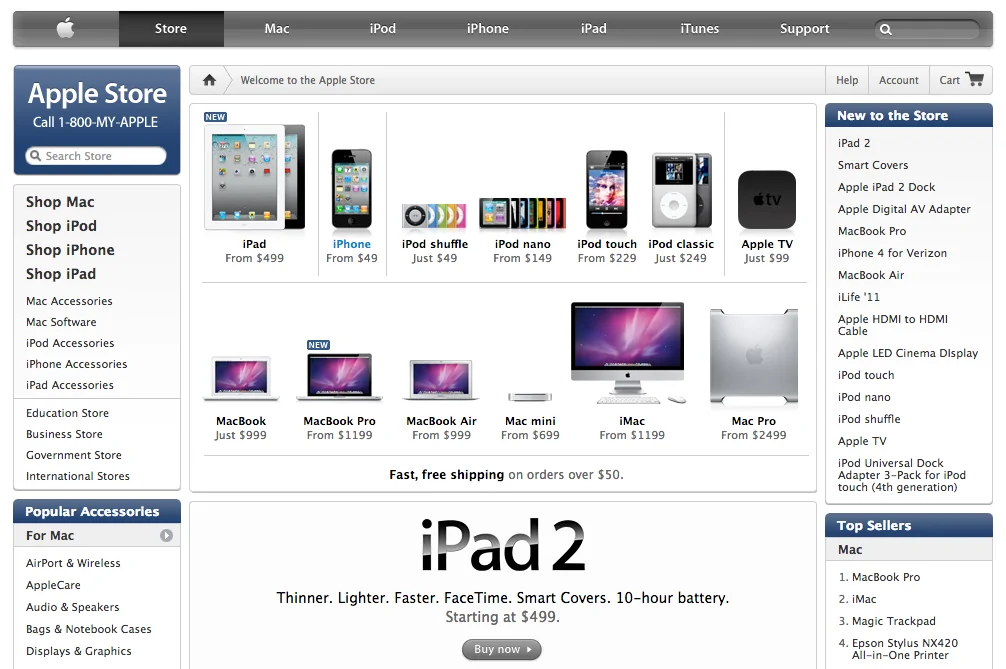
I’ll give you a few visual examples. This was how Apple’s website looked like in 2011:

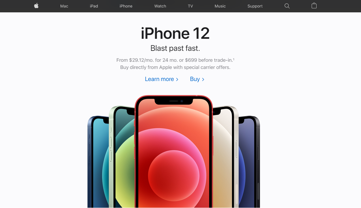
Even though it looks good, the brand is known for their innovative design. Would it be coherent to their brand if their website was still the same, a decade later? Not at all. Here’s what their website looks like today:

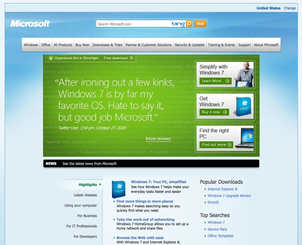
Microsoft is another good case on how website design can evolve in ten years. Here’s how it looked like in 2010:

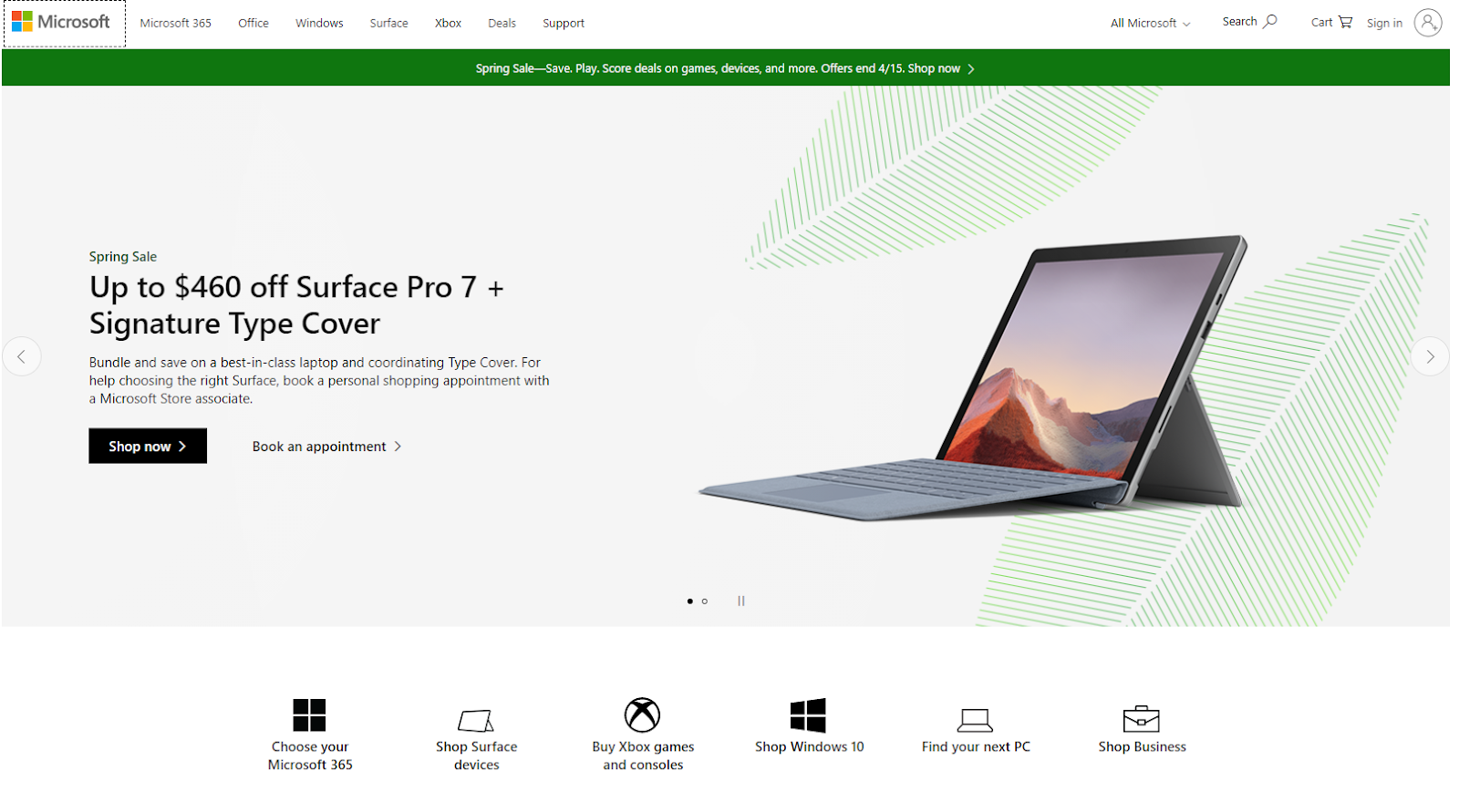
And this is how their website looks like in 2021:

The point we’re trying to make is that your website won’t ever be finished. It’ll always be a work in progress. Even if you’re nailing it right now and getting a ton of leads, results, and sales, there is no guarantee that it will still yield the same results years from now.
Chat us if you have any question. Whether if you’re thinking about a website refresh, or if you want to start something new from scratch, our talents are always happy to help.