That’s how much time the average recipient will spend reading your email.
In other words, you have less time than it takes to purchase a latte at Starbucks to elicit a response from your audience. So if you want to stand out amongst the clutter and get the reader to buy in, your design is essential.
Unfortunately, email design is not the simplest case to crack. With multiple platforms, tools, and more than 30 service providers in use today, it’s tough enough to be a master of one trade, and nearly impossible to be a master of all.
With that being said, nothing is impossible. We’re here to show you how you can ace your own email with some tricks of the trade. So use the next 11.1 seconds to take a deep breath and roll up your sleeves–then read on!
What to consider before you start
First things first–before you even begin the design process, you need to first consider the platform you will use to create the email.
Will you be using Mailchimp, Hubspot, Marketo, or something entirely different? Getting familiar with your company’s platform of choice will make all the difference in terms of how you design the email.
For example, should the content be easy to edit without needing to go anywhere near code? If so, it’s important to become familiar with each platform’s editing capabilities.
Alternatively, if you’re tasked with coding, there’s a different set of considerations. When designing with HTML in mind, for instance, there are numerous things to keep in mind:
- Font: Keep it simple. The fewer and more simple the fonts, the better. If your brand’s logo is a wordmark, such as IBM or Microsoft, you can often upload a PNG instead of trying to match that font. The same is true for any special pieces of text that were predesigned.
- Layout: In comparison to visual design, diagonals and vertical centering are more difficult in HTML. Try to avoid these and instead utilize square assets that give the illusion of diagonals. The layout of an email should guide the viewer in terms of what they should check out first and where to go from there–it should also be scannable. (Remember–11.1 seconds is usually all you have, with readers often reading less than 75 words in total!) Create chunks of content to help make the content more readable.
- Layers: Much like the font, you want to keep the design of your email straightforward–avoid multiple layers or small details whenever possible. Extra lines and accent images can not only make the email less readable and increase loading time, but also make it difficult to achieve alignment in HTML.
What to consider before you design
Once you know what you’re working with, it’s time to create your work of art: the email. Here are a few of the many things to consider:
Subject line
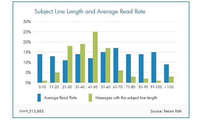
While most subject lines are between 41-50 characters, research indicates that 61-70 characters result in optimal read rate. Find yourself at 50? Try adding another 15 to get to the sweet spot.
Layout
Just as the subject line should hook your reader, the method in which you lay out the body of your email should reel them in. Here are some of the most popular ones:
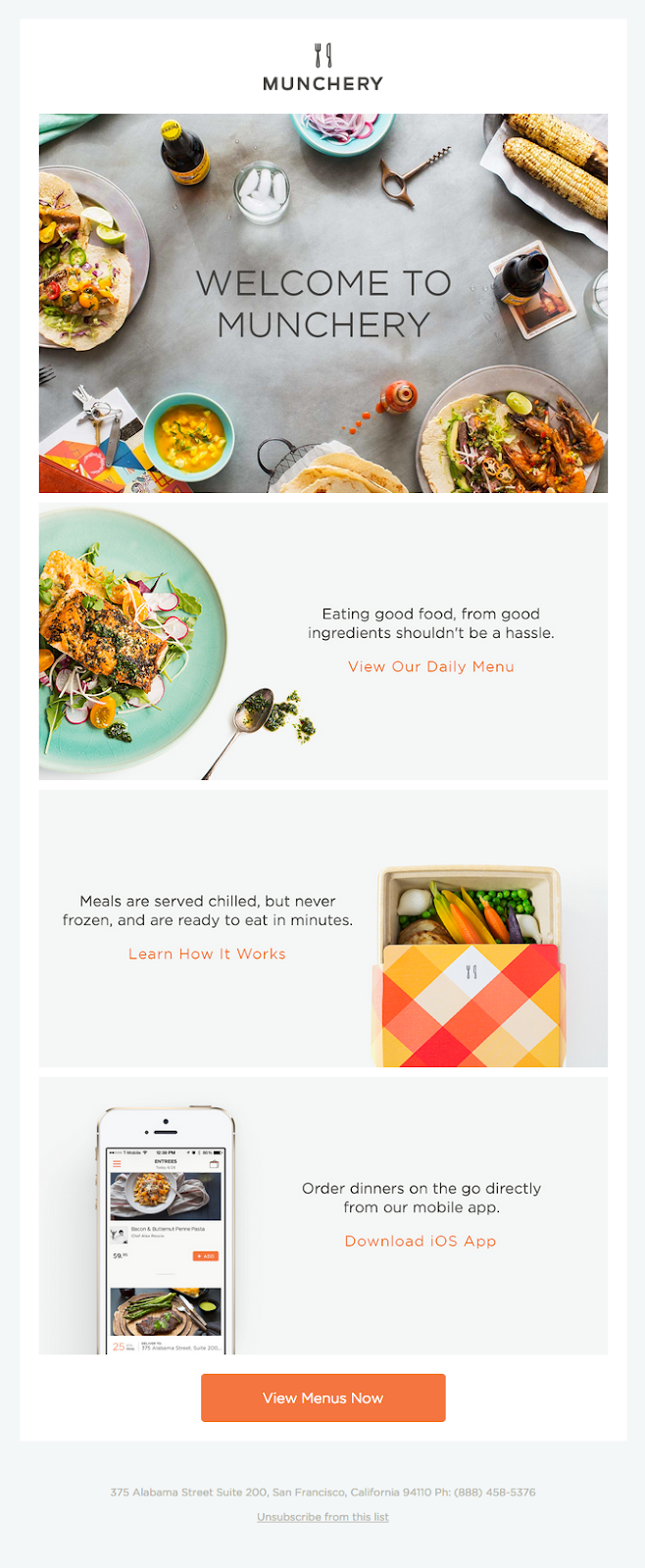
- Inverted pyramid layout: Want to draw your readers in–or in this case, down through–the content? (That’s a rhetorical question–we know you do.) Try an inverted pyramid! With this model, you can capture attention, build anticipation and then end with your call to action. Imagine it this way–you want your readers to summit your upside-down mountain and make it to the peak to stake their flag, aka click.
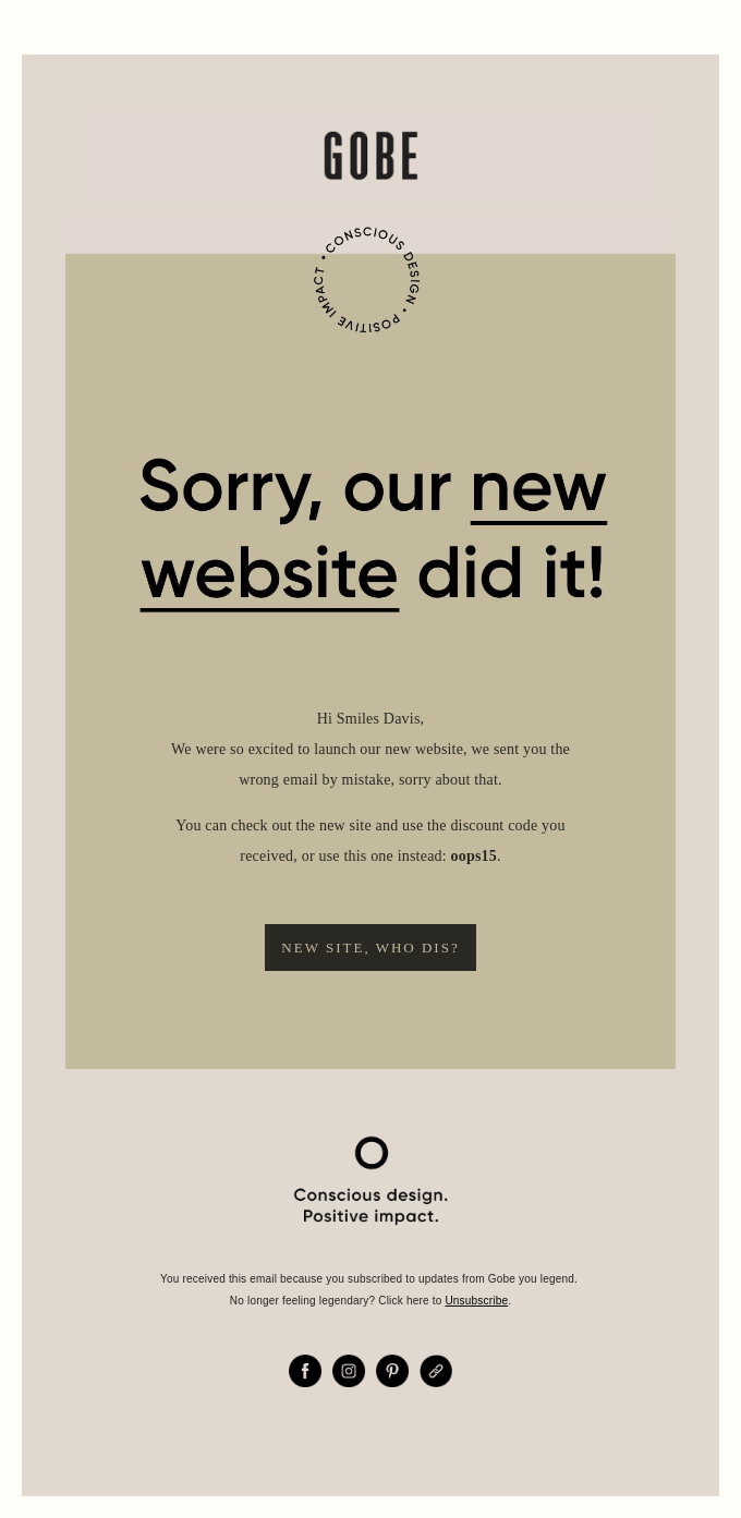
- Zig-zag layout: Another popular option? The zig zag, which uses imagery or color blocking to guide the reader through each step of the email. If the inverted pyramid was a mountain, picture this as a staircase–one which is not only pleasing to the eye as it descends, but helps simplify each section so it’s easier to read.
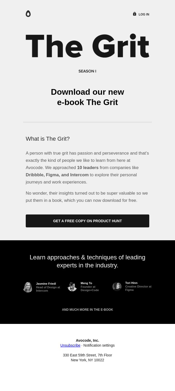
- One column layout: And of course, if you want to go with an ol’ faithful approach, there’s the column–a layout which is mobile-first and universally adaptable on desktops. Consumers can navigate the email without feeling overwhelmed, making this a preferred layout for many.
No matter which layout you use, though, make sure it leads your readers to email’s holy trinity: the CTA, or Call to Action.
Call to action
Keep your eyes on the prize: the call to action. If it’s buried in content or blends in with other hyperlinks, you’ve lost the golden opportunity to convert.
In order to make sure neither of these situations happen, a button is often the way to go. The goal is not to make it as big as possible (after all, you don’t want to be glaringly obvious and/or have it detract from other content), but instead to make it pop. Leave white space around the button–just enough to draw attention but not too much to where it is disjointed from the rest of the text–and watch the deals close.
Pro tip: Because many email clients will block image loading by default, designing your buttons as images can render your efforts futile. Instead, use a bulletproof button (a small snippet of HTML and in-line CSS) to ensure that your button still shows up when images are turned off. You can use tools like this one from Campaign Monitor in order to create it.
Images
Another way to keep people engaged? Images. After all, humans are visual creatures–as evidenced by the fact that the human brain can process images seen for as little as 13 milliseconds.
However, when we say images we don’t mean just any image–if it doesn’t connect with your message or speak to your target audience, you’ll end up detracting from your message.
Use on-brand images, and if you have the time and/or resources, create images specifically for your email campaign. If not, be smart about your use of stock images, making sure to pull ones that are quality and on-point. If you need inspiration, check out our article 10 stock photo sites you need to know about!
Video
Much like static imagery, video is a great tool to keep people engaged.
The caveat? You guessed it–email service providers don’t always play nice with video. This includes the #1 and #3 most popular email clients, Gmail and Outlook.
While you can’t always watch video inside of the email, though, over 50% of email clients support HTML5–making it possible to embed video in your email. Many email service providers also enable you to have a static image with a play button that links to the hosted version of the video.
If all else fails, use an animated GIF–after all, who doesn’t love a good GIF?
Web fonts
Not all fonts are created equal–not when it comes to email, at least. In order to make sure your font is supported universally by email clients, use one of the below:
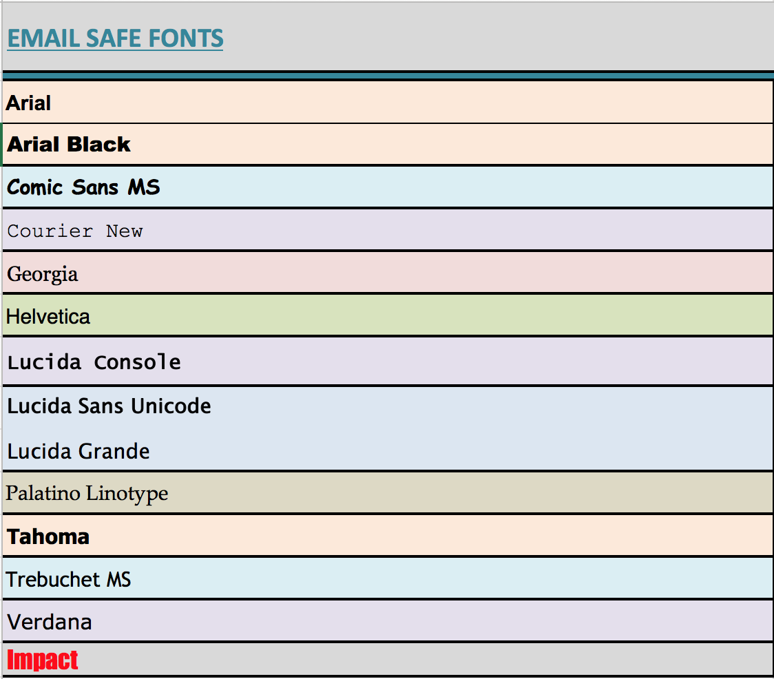
And one more thing–To avoid spam filters and achieve the best results, don’t use more than two different fonts in your email. Like the saying goes, less is more (impactful).
Mobile optimization
Last but certainly not least, make sure you optimize for mobile in every email you send. Across all demographics, 47% prefer to open email via mobile applications–so you can’t afford to ignore it!
Whether you use a mobile-friendly template or design every email from scratch, be sure to:
- Use minimal body copy. Otherwise, your readers will see a wall of text when they open the email, which is the opposite of inviting!
- Increase the size of the body copy if it’s small on desktop–16px is a good standard. If it was small on your computer screen, even people with 20/20 vision will be squinting once it’s on a phone, and you’ll likely lose them.
- Have one, crystal-clear CTA button that is easy for fat fingers to click. According to a recent MIT study, the average size of an adult index finger is between 1.6cm and 2 cm, which translates to between 45 x 45px and 57 x 57px on a mobile device.
What to consider before you send
Congrats–you’ve just designed the perfect email! That means you’re done, right?
WRONG.
There’s yet another thing that can dissuade your audience from reading your content. That elephant in the room? Errors.
As a result, you must always follow the “better safe than sorry” approach and double check your work. We’re not talking about just grammar and punctuation or even checking for functioning hyperlinks, though–we’re talking full visual and technical quality control.
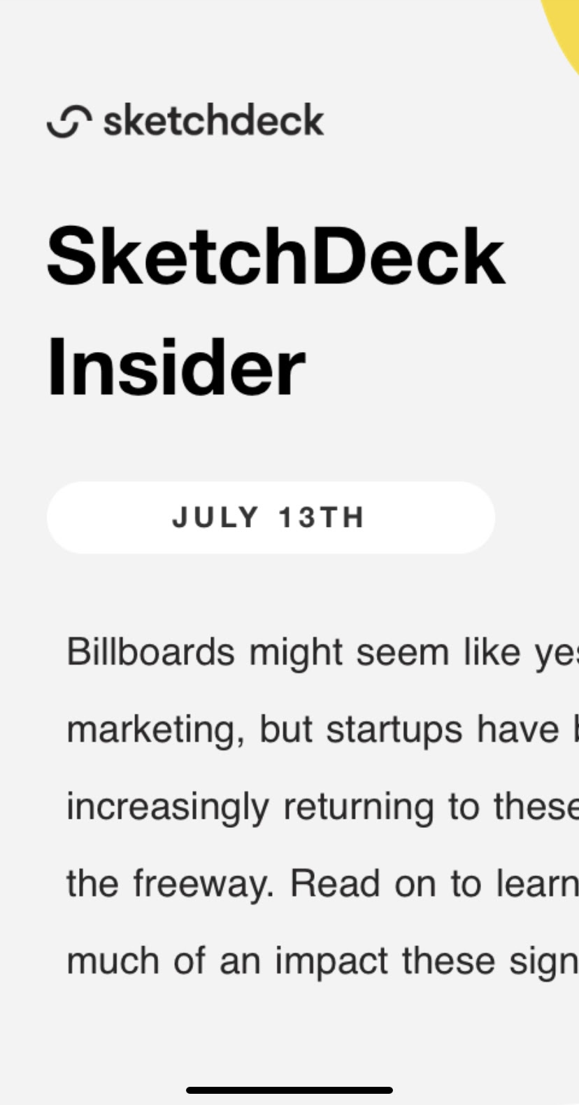
After all, emails often display differently depending on the device on which they are viewed, whether it be a computer, cell phone, or tablet. It’s increasingly important to make sure emails are mobile-friendly, with 47% preferring to open email via mobile applications. After all, you wouldn’t want your customers to see this….
Instead of this…
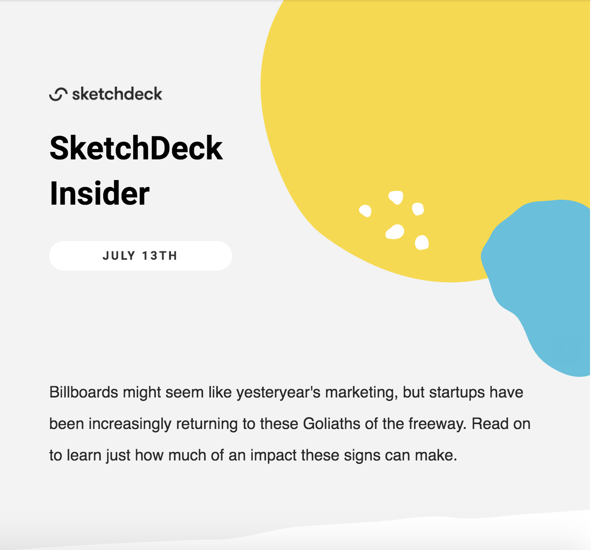
The images above illustrate exactly why it’s important to take the time to send the email to both your phone and computer and view the same email in multiple places. When using platforms such as Mailchimp or Hubspot, there is typically a button that allows you to easily send a test email. To open the email in your browser, download the .zip file, extract it, and open up the HTML file contained inside.
After all, there’s nothing worse than opening an email to this:
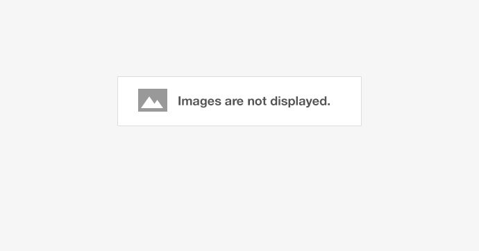
Mitigate the risks by testing and then testing some more–and even if you see the images load multiple times on multiple platforms, prepare for the worst with Alt Text. That way, even if your image doesn’t load, the description provided will allow the reader to understand what was being communicated via visuals.
If you need an easy shortcut, use a testing platform such as Litmus, which offers real-time previews in relation to dozens of email clients. This service essentially mimics numerous email clients, showing how your code will render in each of them.
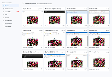
With this being said, it’s important to note that even platforms like Litmus are not perfect (much like all technology). Due diligence is still highly recommended in order to make sure your readers are not turned off by formatting errors and more.
Additional resources
With all the options at your disposal, this information is just the tip of the iceberg. If you want to read more information specific to your company’s email service, here are a few additional resources:
- Hubspot: This guide covers templates in the layout editor.
- Mailchimp: For inspiration or guidance, check out these 100+ templates and designs.
- Marketo: Here’s how to get started when aiming to create an email template.
- Blueshift: A guide to Templates & Creatives.
- Outlook: Avoid these Outlook rendering issues.
Have a creative vision but too busy to execute it? Reach out if you’d like our help!