You’ve finally secured a sit-down meeting with that promising prospect you’ve been nurturing for what feels like forever. With such a huge opportunity in front of you, how can you maximize your chances of delivering a truly compelling sales pitch?
What if we were to tell you that there are graphic design techniques, backed up by human psychology, to help you be more persuasive? Well ready for it? There are!
We’ve looked through the last fifty pitches we’ve designed for world-class companies and catalogued our favourite tools of temptation. With each we’ve included an explanation of how it works and a before-after to show how the design transforms your message.
We’re excited for you to try some of these in your pitches. Commence the dog and pony show!
1. Set the stage with urgency and opportunity

It’s the start of the pitch, and a great time to anchor the story on something big and motivating. Psychologically speaking, the start of your pitch is a blank slate, ready for you to draw whatever picture you wish. Therefore, it’s an opportunity to open with lofty ambitions of what your prospect can achieve.
From a science perspective, this tactic triggers the Oxytocin trust hormone response, through heightened storytelling, which helps the prospect trust you and your solution.
A further way to weave this visual tactic into your sales pitch is through reframing: If you can bring a fresh perspective on the prospect’s challenges to them, you suddenly have extra momentum to carry them through the pitch to your intended destination.
2. Create an attention-grabbing agenda slide
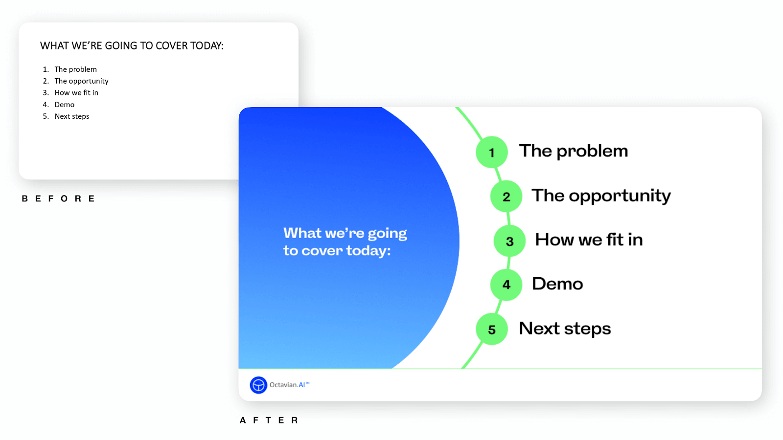
Agenda slides. Boring filler right? We don’t think so!
We’re big fans of making our agendas as beautiful and digestible as possible. The first goal of design is to make content easy to understand, and applying this to an agenda helps everyone know where they are going.
With a good looking agenda slide you can take some time to take your prospect through it, mapping out your journey together. You can align on expectations, needs and how long you have for the meeting.
3. Bring your prospect’s challenges to front of mind
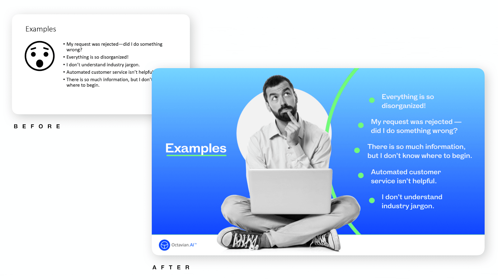
Ready to build empathy and increase the potency of your pitch in one slide? This tactic uses the visual metaphor of putting your prospect literally into the frame. It has two main aims:
First of all, focusing on your prospect gives them attention and builds feelings of rapport. By demonstrating that you already know some of the challenges they are facing, you trigger trust responses, further helping them open to your proposal.
Secondly, you bring the challenges the prospect is facing to the top of their mind. By walking through each of the challenges they’re feeling you activate those memories. Once re-activated, those memory-neurons will remain in a more heightened state for the rest of the meeting.
4. Visually demonstrate the complexity of the problem
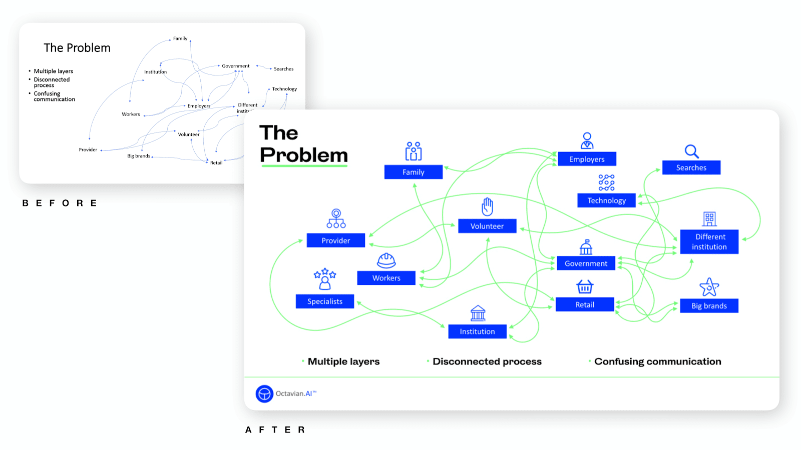
Here’s a chance to unleash your (slightly) diabolical self! This technique portrays the complexity of the prospect’s problem in an ingenious way.
It works like this: we take the complexity of the problem (that we’ll later solve) and translate it into visual complexity. We literally create a high cognitive burden, so your prospect probably feels exhausted just looking at it. That makes it a great design metaphor for the message you’re trying to convey.
Furthermore, this slide again shows how well we understand the problem. This homework translates into showing our competence and integrity, which once again, you guessed it: builds trust.
5. Contrast with the simplicity of the solution
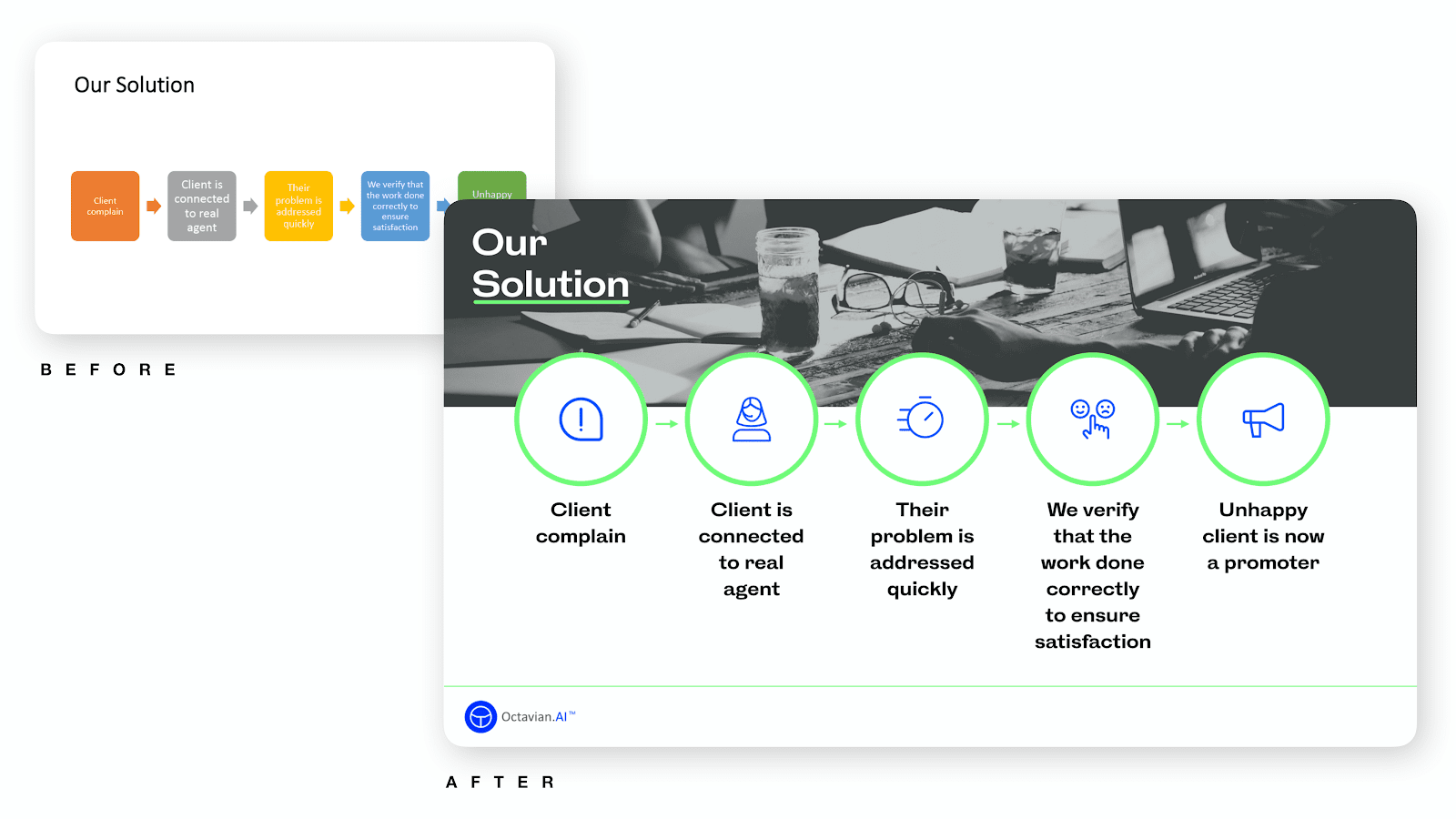
Now that your prospect has seen the problem side and are reaching for their anxiety pills, it’s time to offer them some sweet relief. Relief that we can sell them.
Playing on the tactic from before, we’ll now do the contrasting opposite action: show simplicity. Where we previously employed cognitive burden, now we offer cognitive relief.
This reduction in cognitive load then helps imbue our solution with an afterglow effect.
To employ this technique, it’s important you simplify your solution as much as possible.
6. When the details matter, use design to communicate them
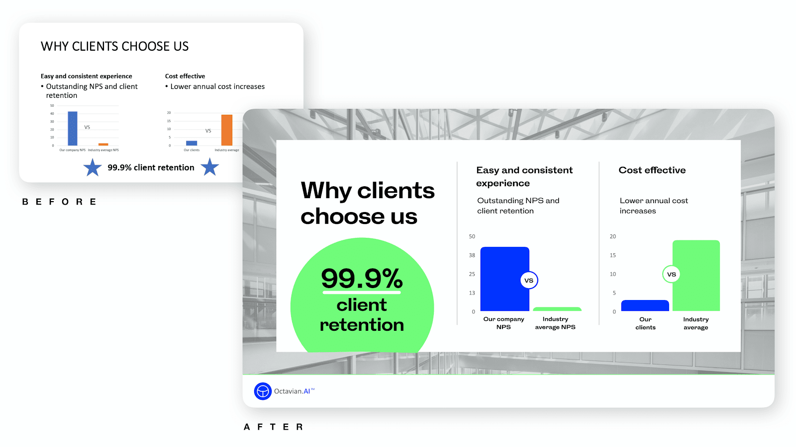
Whilst we generally advocate keeping slides simple and low-density, there is a time and place for dense content. In many pitches, there is a point where you need to get down-and-dirty into the details of how your solution competes against others, and how it drives measurable success.
To fit the full, detailed story onto a slide you need to wave the magic wand of design. Designers are thoroughly schooled in the classic techniques for information formatting: hierarchy, chunking, grid layouts, visuals like charts, call-out quotes for visual variety.
An important caveat with this type of slide is it’ll only work in a context that supports taking time to digest it. For example, this is not a slide to use in your next keynote or TED talk. However, in an intimate setting, where you can walk the prospect through the slide, it can be really effective.
Slides like these can also be reused outside of the pitch: they are standalone factsheets, usable by client-side sponsors to help sell and explain your offering.
7. Do the best social-proof possible

We all know the power of creating social proof in a sales process. It’s so important Neil Patel has a blog post about it (see what we did there?). As designers, we want to make your social proof as persuasive as possible. That means you want to include all the goodies:
- Photo of speaker
- Logo of speaker’s organization
- BIG quote text
- Speaker name, title, blurb
And wrap that into a beautiful, captivating package.
8. Provide clear next steps and an action plan
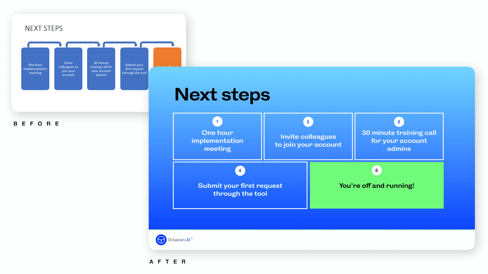
OK, you’re finally nearing the end of your pitch. You look around the room, everyone is excited for their problems to finally be solved. You’re getting ready to bust out your glee-style big number.
But before you get too carried away, there’s everything that’s going to happen after this meeting. By sharing any future steps and timeline, you can alleviate anxiety about what lies ahead. Try to visually convey a short, linear path with just a few clear steps. And then double-down by asking them again if everything makes sense.
We suggest visually highlighting the end of the process ahead, the point where everything is done and success is achieved – that way this slide’s focal point is the most positive point.
9. Make the best last impression possible
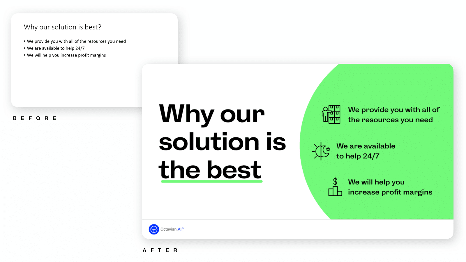
It’s the last slide. Let’s leave exactly the message we want, and put it in a way that is most likely to stick.
Research reveals that we tend to remember the beginning and end of events. That means this is one of the slides most likely to be remembered.
Next up, our short-term memory is built to handle groups of three better than larger numbers. Therefore, we reduce the entire story of the pitch into three simple messages.
To put the final touches to this psychological cocktail, we use visual cues for memorization combining an ancient memory technique (hello, Greece) and the modern neuroscience basis for using icons.
Put all of that together and you have the closing three-points slide. Voilà!
Now it’s your turn: get creative!
We hope you’ve enjoyed these visual tools for persuasion. Try some out, and let us know how it goes!
And, if you just so happen to want some help turning your plain slides into stunning works of sales art, we’d love to help.
