Within the first 13 milliseconds of starting your sales presentation, your prospects have already visually identified the content of the images in your sales deck and begun emotional processing of them.
That’s 10x faster than the blink of an eye.
Before they start understanding your pitch on a conscious level, they’ve already judged your deck based on first impressions, experienced it emotionally and filtered it through a number of cognitive biases.
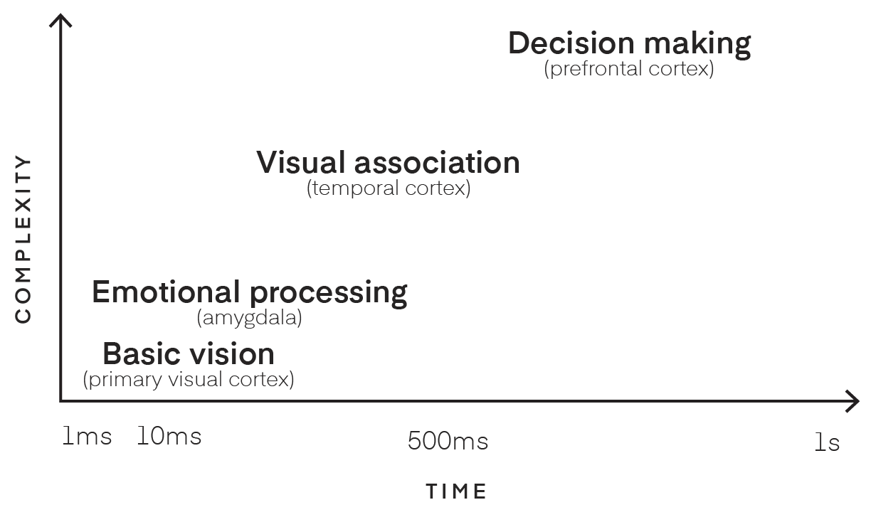
That basic visual processing is just the first step of a cavalcade of activation and processing as the visual image spreads through your brain. In under 100 milliseconds, the emotional processing parts of the brain will be activated, followed shortly by the visual association cortices, helping you to decipher the scene. Finally, less than a second after the image was first shown, your prefrontal cortex starts the decision-making process. From photon to choice in a few hundred milliseconds.
That’s why design so powerfully affects the psychology of sales. Your reactive visual processing happens so quickly that it frames all of the high-level cognitive processes that come later.
It’s through design that you can sway and persuade your prospect. By using design well in your sales presentations, you can already get your prospect’s favorable attention before you’ve even opened your mouth.
Your sales materials’ design instantly triggers a first impression in the brain
And that emotional response will color the rest of your sales interaction
Humans are primed to recognize emotion in other people to help us navigate our complex social structures. As soon as you see someone smiling, for instance, your amygdala recognizes “happiness” and draws your attention to it. The same effect can be triggered by a firm handshake or a pleasant greeting.
This is the power of first impressions. In a 2009 study from NYU’s Center for Neural Science, Daniela Schiller and her colleagues looked at the neural correlates of first impressions. They found that activity increased in the amygdala during positive first impressions, influencing what the person paid attention to for the rest of the interaction.

The amygdala is an almond-shaped, subcortical part of the brain. Whereas the cortex is the part of the brain that controls our consciousness, subcortical structures are much older evolutionarily and are crucial to how we process things like emotions.
When you’re afraid, it’s your amygdala making you afraid. Same when you feel love. Without an amygdala, you would feel nothing.
Having this direct line to the amygdala means that visual design can elicit both positive and negative emotions almost immediately. People are making immediate assumptions just from your design.
This power is in the hands of any designer. Using the right imagery, you can produce a heightened emotional response.
These positive first impressions from design are vital for a great in-person presentation, but they are even more critical when you are giving a pitch online. Then, you have no handshake or smile to greet the person with. All the prospect has to go on is the visuals. If your first slide is dull, then so are you. If it evokes excitement, interest, or warmth, then so do you.
Check out this example on personal branding from Jarkko Sjoman. The first impression grabs your attention.

This is a great example of how design can use positive first impressions to build anticipation. It also has two factors that are guaranteed to get your brain’s attention:
- Color: Color is critical to our survival. We have neurons in our inferior temporal cortex, a part of the brain that helps us recognize objects, that respond only to certain focal colors—red, green, yellow, and blue. Throughout evolution, these colors have been important to help signal excitement (red), naturalness (green), or calm (blue).
- Recognition: Humans, and in fact a lot of other mammals, have specialized visual areas that respond only to faces, the fusiform face area. This is because recognizing friend from foe, and having the ability to read emotions in faces (which is our most expressive body part) is so important to our social abilities.
This particular slide from the deck makes great usage of color and faces. The hot pink and orange hues appeal to that sense of passion and excitement. Then your fusiform face area is pulled to the face of Walter White, in both recognition and trepidation. Just from the color and image design, you will immediately pay attention to this slide as you wait for the presentation and want to watch what’s next.
Basic design preparation activates a positive emotional response in your prospect’s brain
Which triggers them to reciprocate your time and attention
Whereas passion is seen as a key factor in the sales process, there is something that prospects like to see even more: preparation.
For instance, scientists at the University of Washington studied the investment decisions of venture capitalists and found that while VCs do like to see passion during an investment pitch, it was preparedness, not passion, that most positively influenced funding decisions.
Putting time and effort into your presentation kicks your audience’s reciprocity circuitry into gear. Reciprocity is built into your brain for growing and maintaining cooperation. As social creatures, we have developed specific mechanisms to make sure we play nicely with others. The more clearly you present your product and arguments, the better understanding every prospect will have of your company.
If your slides looks like this, expect yawns.

The one thing you never hear is that sales went down with good design
The Design Management Institute has been able to quantify the value of design with its Design Value Index. The DVI tracks an index of design-obsessed companies compared to the rest of the S&P index. Companies in the DVI are those like Apple and Nike who place design at the forefront of everything else they do.
From 2003 to 2013, these 15 design-centric brands had a massive 228% ROI gain compared to the S&P:
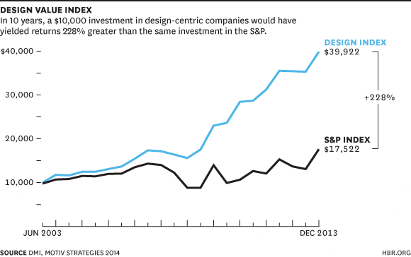
$10,000 invested in these 15 brands returned almost $40,000 in 2013. The same investment in the S&P would have only netted you $17.5k. In the UK, the Design Council found exactly the same thing. Their Value of Design report found that “for every £100 a design alert business spends on design, turnover increases by £225.”
In sales, the cost of design is so low relative to the price tag of your highly-paid sales team. Better-designed sales materials are likely to cost you less than 1% the price of your sales team’s salaries. Get lift that’s even just 5% across your sales team, and your ROI will be over 400%.
Good design pays. Subscription payment platform Zuora found exactly that. This is the first slide from what sales executive Andy Raskin called the greatest sales deck ever seen, that helped Zuora close some of their biggest deals:

Not only does it use psychological components that sing to the amygdala and early visual system like bright colors and a smiling face, but throughout the deck this also hits a few other important notes in terms of thought and preparation:
- Organization: Instead of launching straight into the product, the first slide sets the context of the problem in the larger picture of a changing world. It uses design to build a story throughout so that by the time you get to the product slides, the viewer is already invested in the story.
- Simplicity: In the words of Mark Twain, “I didn’t have time to write a short letter, so I wrote a long one instead.” The deck’s simplicity shows off the level of preparation and work that went into it. It presents clear, engaging visuals that are part of the wider narrative that the presenter is offering.
This is effectively a presentation about payment software. It could be a dull recounting of the technologies used. Instead it is a beautiful, simple design that takes the viewer on a journey through the “subscription economy.” By the end, the prospect wants to be a part of the story Zuora are telling.
Personalizing your sales deck saves your prospect’s cognitive energy
Which biases them towards familiarity
Like likes like. People are more likely to make a positive decision when something is familiar to them. This similarity bias mental model resides in your prefrontal cortex. That’s the part of the brain where thought, memory, and emotion all come together to help you make decisions.

Mental models, sometimes called heuristics, are a secret weapon of the brain. They allow us to save cognitive energy by fitting what is happening in the world to past experiences and previous models we have built. We can then just follow the model to make a decision rather than trying to take in too much new information.
These heuristics can be used in design to make your presentation seem familiar and positive to a prospect even when they’ve never see it before.
You should customize your deck to fit the company you are presenting to:
- If you are presenting to startups, use flat, minimal design and copy. The key decision makers are probably in the room, so it is more important you tell an effective story with your design on that day.
- If you are presenting to enterprise, you can use more classic design, color and information. These decks are going to be passed around the office for multiple stakeholders to see. They need to stand alone.
Marketing automation tool Eloqua use these different strategies to appeal to startups and enterprise in their sales presentations:

In this presentation targeting startups, the company focus on the lead generation abilities of Eloqua, using a cartoon design style that is appropriate for the audience. The font, images, and colors are more playful than the enterprise sales deck:

Even though some of the same topics are touched on, the enterprise presentation feels far more corporate, using more business-focused language, images, and ideas. Each slide contains more information and the overall design is more traditional.
These customizations can be as simple as changing copy and color, or as complex as redesigning the entire presentation to fit their branding and logos.
When the prospects watch the presentation, it is entirely native to them and they can project the positive model of their own company onto your company. This will make them feel like your product is already a part of their company, confer legitimacy on your brand, and make it easier for them to make their decision.
By doing that, you’re combining the familiarity bias with reciprocity. Your deck will feel familiar in terms of design, and you’ll show off how much homework you’ve done on the company and how much preparation you’ve put into the pitch.
Bonus: great design makes you more confident as a sales person
And that’s one of the biggest factors in selling effectively
Great design doesn’t just affect your audience, it also affects you. If you are standing in front of a presentation that you have put effort into and have confidence in, you are going to be more effective.

There were many secrets to the success of Steve Jobs, and preparation was one of them. With the design weight of Apple behind him, it was unsurprising that he was totally confident in his presentations.
As the audience was watching his presentation, their visual cortex was going into overdrive, their amygdala was getting emotional, and their prefrontal cortex was weighing up all this information to make a decision. A lot is going on in their brains.
But a lot is going on in his brain as well.

His posterior cingulate cortex was going all green. When we are reflecting on ourselves, studies have shown that this area is activated. This part of the brain is involved in our own awareness, and linking what we are doing to previous memories.
This is sometimes called “metacognition,” or thinking about thinking. We have circuits in our brain that are devoted to self-evaluation. They are ones that are constantly critical of your own performance and wondering whether you are doing well or not. Again, the prefrontal cortex comes into play here.
Studies on self-evaluation have shown that when we are confident in our own assessment, areas in the prefrontal cortex associated with executive function and theory of mind are activated.
By putting in the effort to produce a well-designed presentation, we activate these areas in our own brain. We become more aware and evaluate ourselves more positively. Higher positive self-evaluation is correlated with better success.
———-
Visual design works so well because it works with the brain. It takes advantage of what our human brain has been designed to do — take in an amazing array of visual information fast and make it meaningful. The easier you make that visual task for the brain, the more it will reward you.
When your prospect sits down in front of a well-designed deck, you can be confident that their brain is going to be on your side. If you take advantage of faces, colors, emotions, and heuristics in your design, you’re playing to the brain’s visual strengths.
At each stage, from basics, to emotions, to decisions, you can build up your visual argument. By doing this you can be 100% confident in your design, and 100% confident in winning the sale.
