For several decades, pitch decks have been one of the best ways to sell investors on your business idea. These visual presentations educate your audience about your vision. Typically, they are informative and flexible enough to use in various situations such as face-to-face meetings, post-meeting takeaways and email introductions. When done right they attract the funding you need to get started and fuel your growth.
As we look back at pitch decks of the past, we can see they have come a long way. While the quality of design was not a major focus 15 or 20 years ago, today is it crucial. Companies that are serious about their ideas will invest money and effort into the design of a pitch deck. A poor design will leave a bad first impression with potential investors. Our research has found that for every $2 million raised, you’ll spend at least $1,100 on design.
Let’s face it, fundraising is a competitive process. As more companies have come to realize this, we have seen the quality of pitch decks improve. Yet, as the design has become sleeker and more sophisticated, investors still expect a good business proposal to be the core of your deck.
So, let’s look at how pitch decks have evolved from the early days to modern times.
Older pitch decks
1. Facebook – 2004:
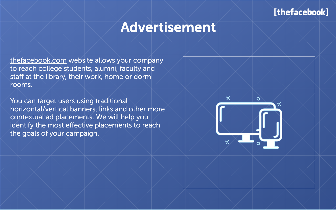
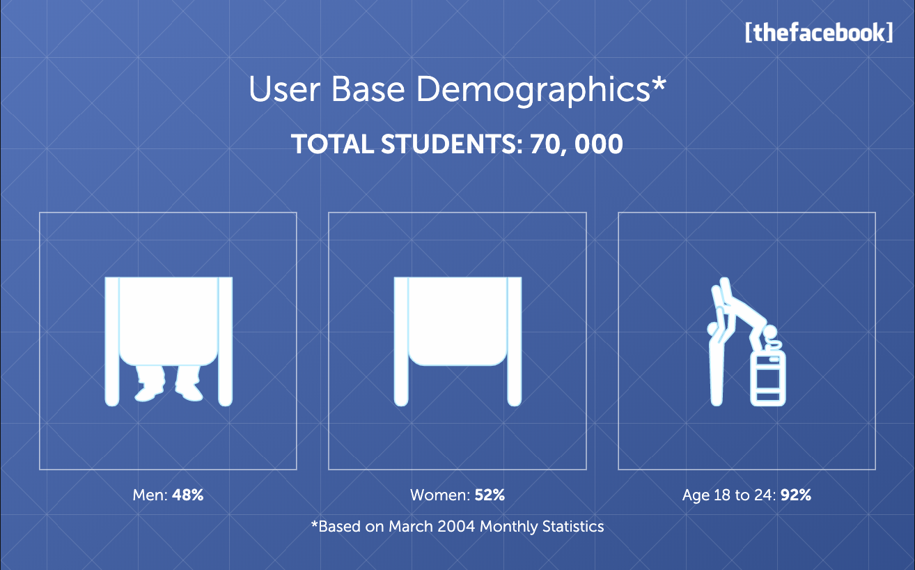
As we can see from Facebook’s original pitch deck, their design was simple and basic. The deck began with a powerful quote. Most slides have a blue background and some short and concise text about their product. Near the end of the presentation statistics and graphics were incorporated but they were very basic. They were also not very PC, which would be a big no-no today.
2. Mint – 2007:
Mint’s pitch deck from 2007 was a little more advanced in style than Facebook. They began the deck with a slide showing off the potential of their product. They included a slide introducing their team before they presented statistics. Following their statistics slide, they compare what they are offering against two competitors at the time.
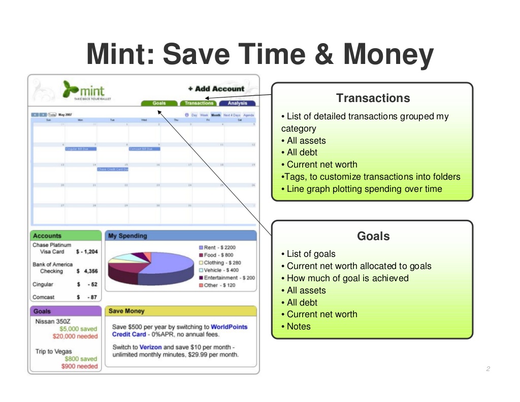
Overall, Mint’s deck is very basic. The font and background color are simple and not splashy. Their graphics are cartoonish and not professional-looking.
3.Uber – 2008:

Uber’s deck was also very simple with a white background and consistent font style. This allows for investors to focus on the content and statistics that were being presented. The graphs that were used added some color as well as detail to their pitch.
4.Foursquare – 2009:
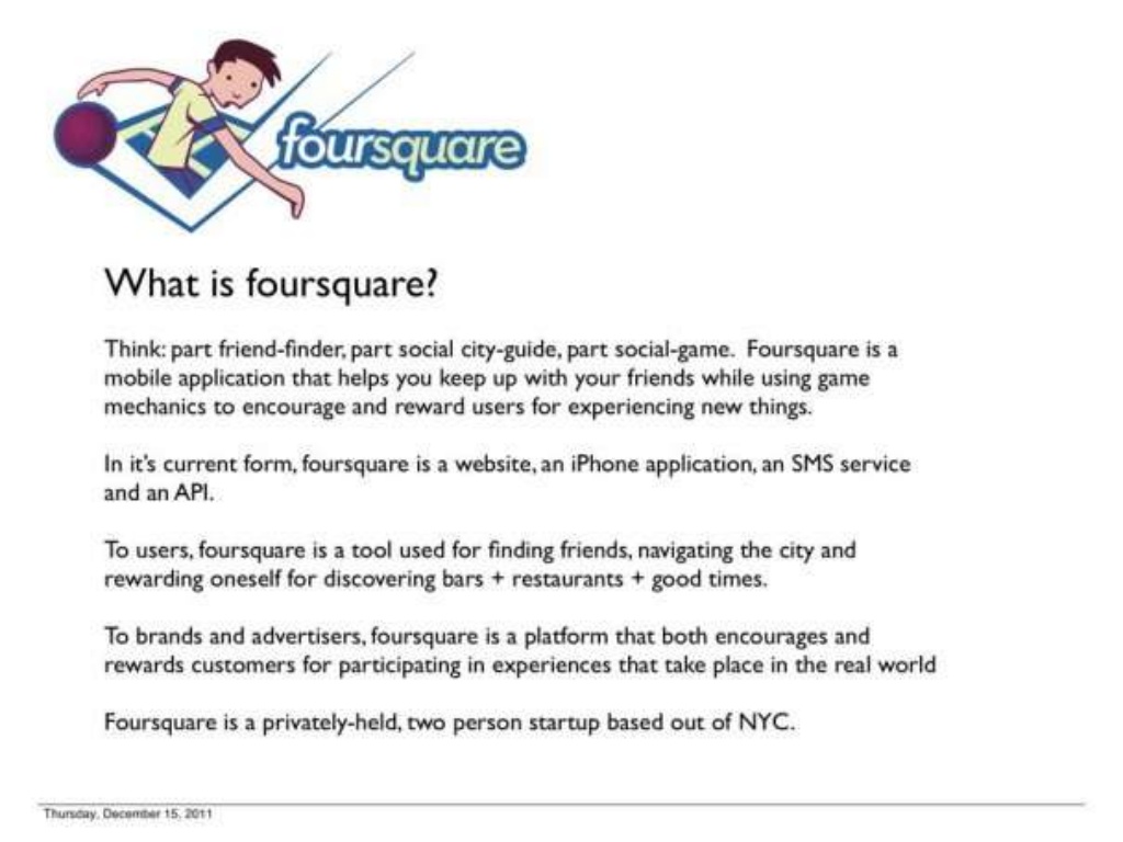
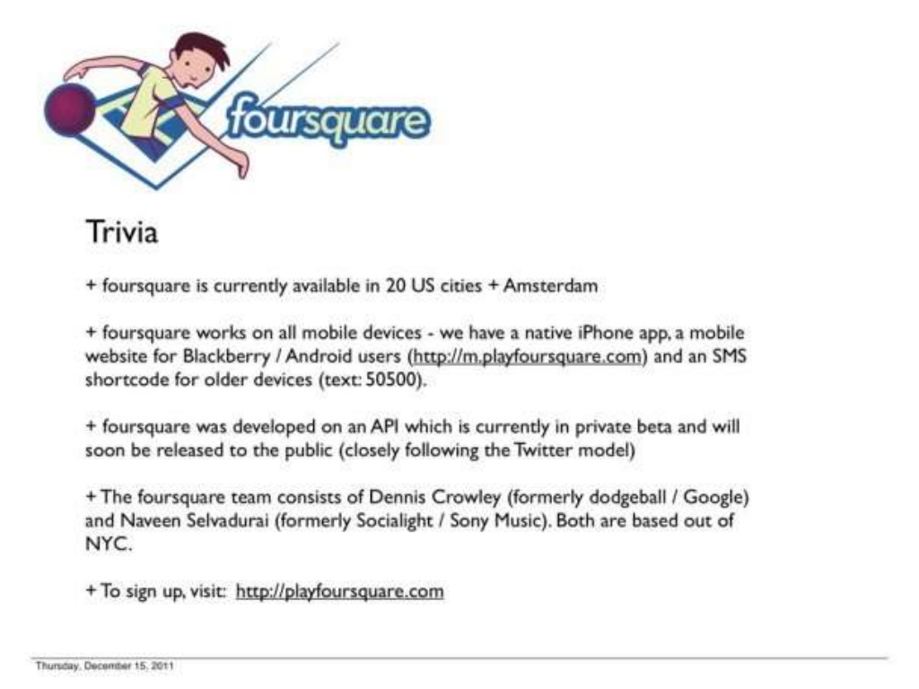
Using an interesting graphic to kick off their deck, foursquare’s pitch reflects the playful personality of their company. However, there was an abundance of smartphone images used through most of the slides, which gets tiresome. Yet, the presentation ends on a fun note with a trivia slide that reveals interesting tidbits about the company’s performance to date.
6. Airbnb – 2011:
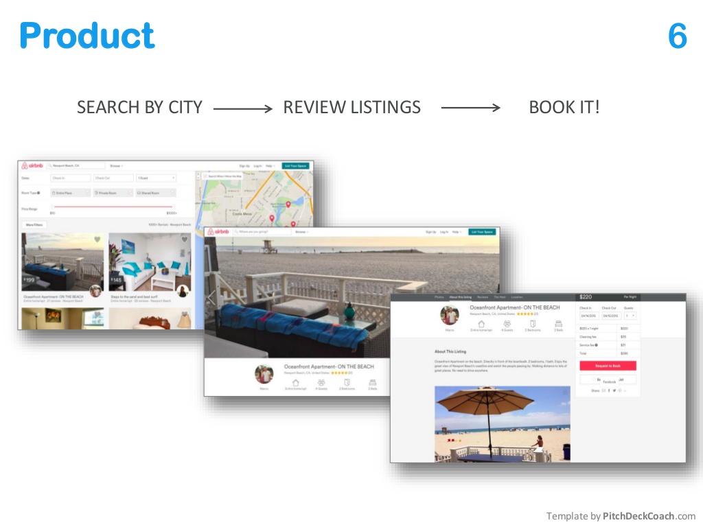
In the Airbnb pitch deck, we see an infusion of color into their font in the first slide. That use of color continues in some of the other slides with black and blue letters across the page. We also see a move from using graphics to photographs. While this is an improvement on the design of earlier pitch decks, it also reveals the company’s culture and reputation.
6. Intercom – 2011:
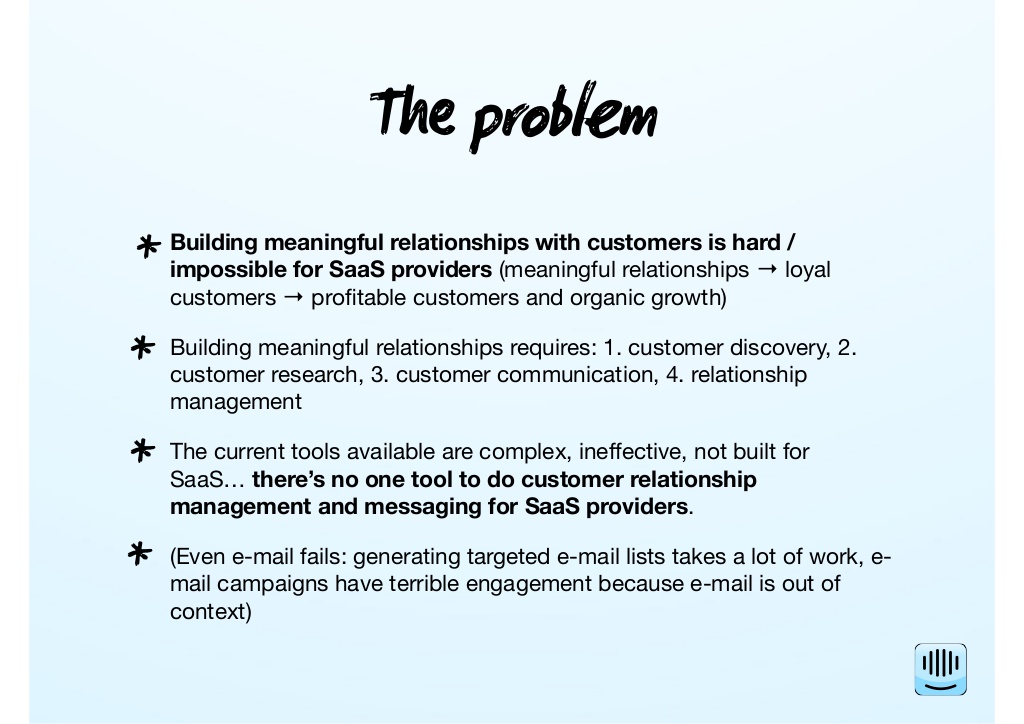
While Intercom’s pitch deck demonstrates a willingness to get away from mono-colored presentations, it still shows the simplicity used in designing decks at that time. Their presentation is largely based on text set against a light blue background. The other thing of note with regards to Intercom’s design is their experimentation with font style. Rather than stick with the serif or sans serif style, they boldly use a more creative looking font.
7. Square – 2012:
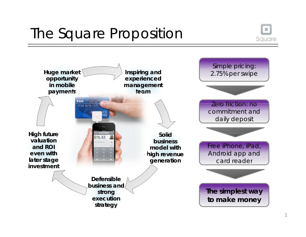
In 2012, Square still relied on a very simple pitch deck design. The content and graphics are presented on a white background. Yet, unlike the earlier decks, there is a lot more content incorporated on each slide. These include statistics, graphics and other detailed information about the product. Essentially, in this deck we start to see a more visually engaging presentation. There is also evidence of branding as the company logo appears on every slide. The font and style is also more consistent throughout the deck. With a main header at the top of the page followed by a double line and then the main content.
8. Buffer – 2013:
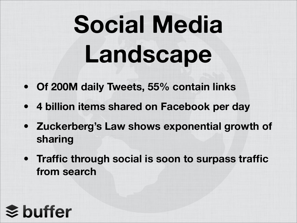
By this time we can start to see an advancement in design. Rather than using a solid color background, Buffer added some style with a subtle graphic that is hidden behind the content of each slide. They also used a powerful quote to start their deck, much like Facebook did in 2004. Their content is concise but key to showing the potential of their product. Using statistics to demonstrate how much they had grown as a startup to numbers that represent the potential they could reach, Buffer positions itself as a solid investment opportunity.
9. Contently – 2013:
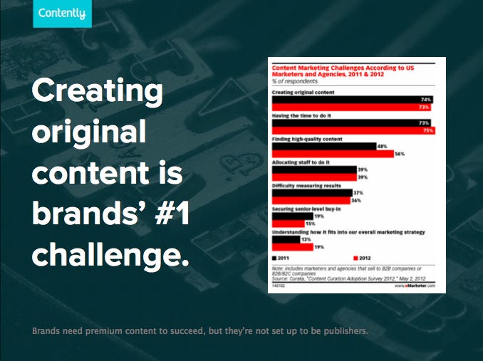
As with other pitch decks around this time, Contently is using more interesting visual elements to sell themselves. Using a dark background with a subtle graphic they promote their content marketing product using graphs, quotes and statistics.
More modern pitch decks
10. Canvas – 2014:
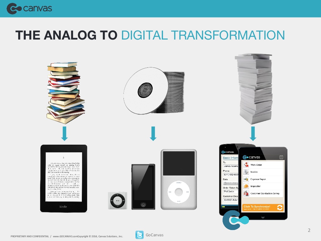
Building further on the pitch deck styles of 2013, Canvas begins their deck with a strong visual element of the analog to digital transformation. Does anyone even remember CDs? In subsequent slides, they use interesting graphics to help make their point. While they continue to use standard pitch deck content including statistics and quotes, the graphics take up the most space on most of the slides. This demonstrates a move towards visual engagement of the audience as well as a greater awareness of branding.
11. Snapchat – 2014:
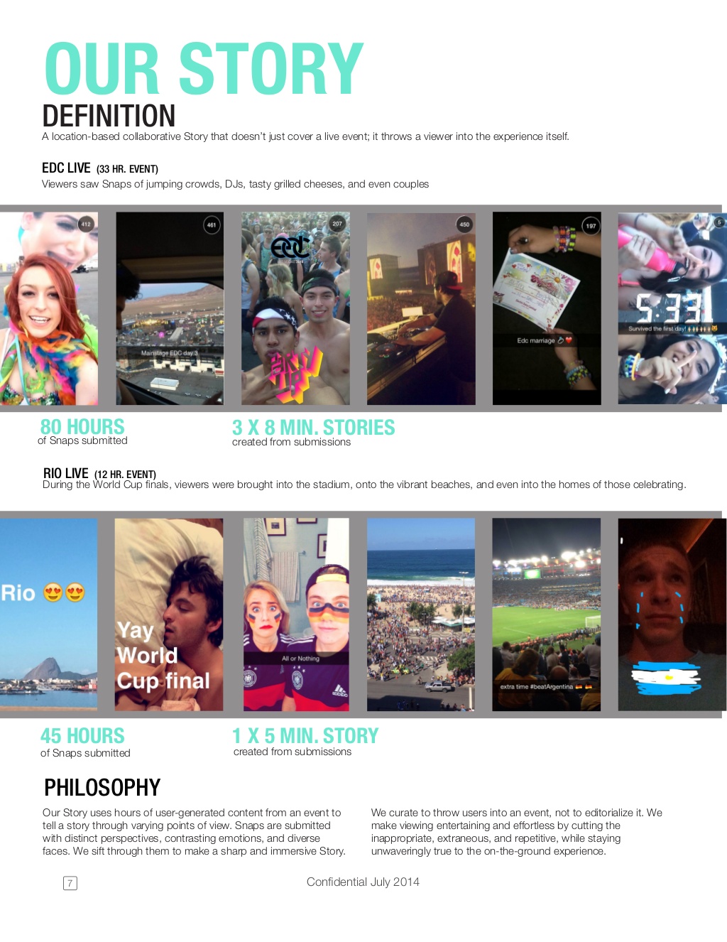
Snapchat’s pitch deck design utilizes engaging visual elements including colorful graphics. Yet, these elements do not dominate the page in the way that the Canvas deck did. Rather, there seems to be an equal use of text and visual to get their story across at the start of the deck. Further in to Snapchat’s presentation the slides become dominated by images that the social media app has collected from users. It just makes you want to check it out. Yet, as their platform is largely focused on video creation this does not take away from their deck but rather displays the nature of the brand.
12. Tinder (Match Box) – 2016:
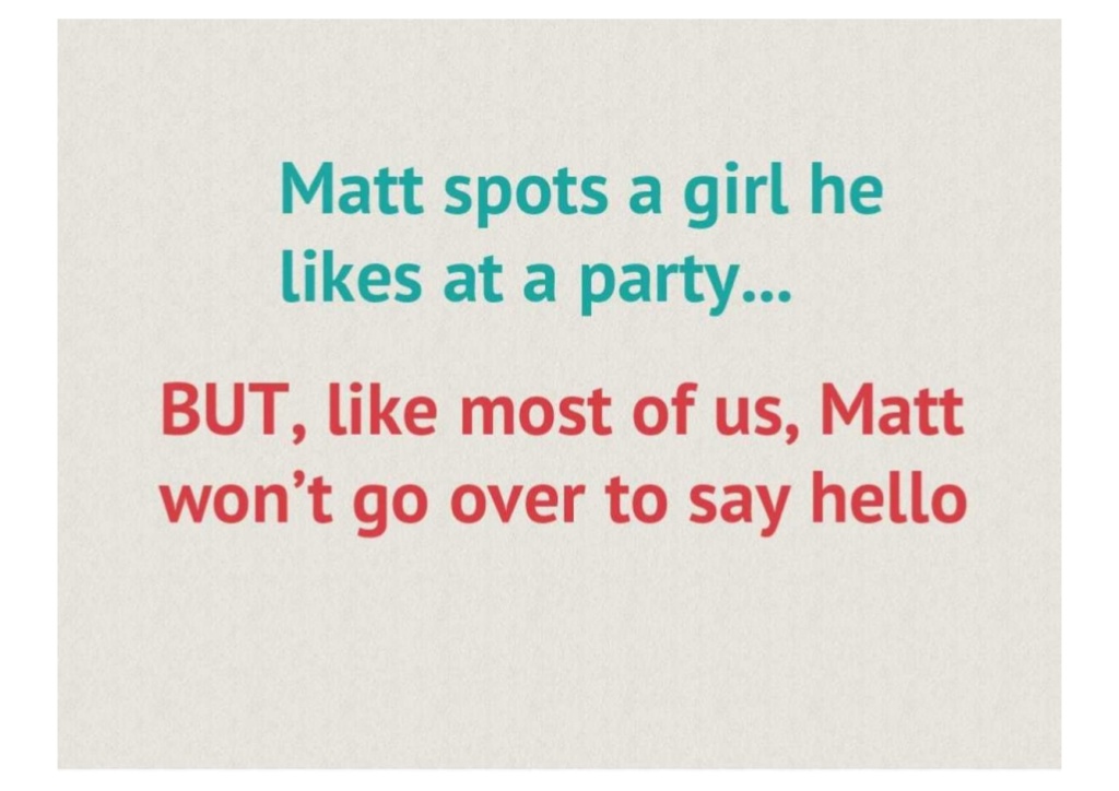
In 2016, Tinder, or Match Box as they were known at that time, focused largely on a mixture of text and images to get their story across. Each slide is built on a light grey background, which is not a strong visual element but it is a move away from simpler designs. While the deck is not big on statistics or graphs, they are still able to demonstrate the potential for their product and show off their fun side.
13. Front – 2016:

Front used a very stylistic approach with a red banner across the top of the slides, coupled with strong visual elements underneath. They demonstrate a much more modern pitch deck: branded, playful and highly produced. They mix text and graphics to present the problem to potential investors. The branding remains very consistent throughout the presentation.
14. MetaCert – 2017:
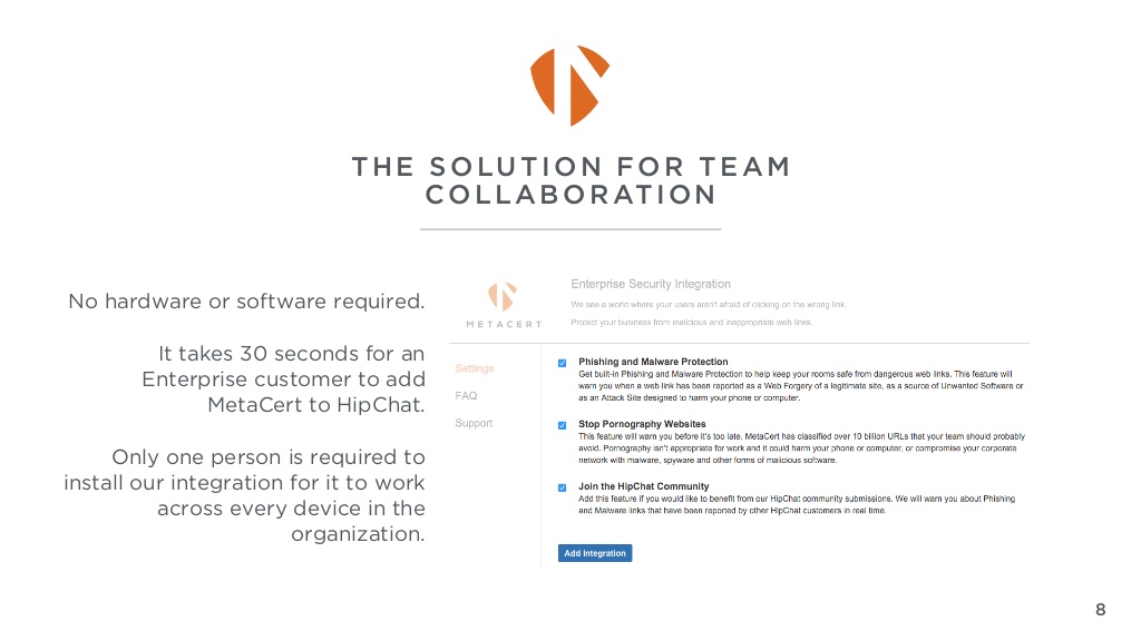
Using splashes of color throughout their presentation, MetaCert’s simple yet effective pitch deck design is similar to Buffer in that MetaCert branded each slide with a logo in the left hand corner. Visual features on the slides dominate the page slightly but the text that is included also helps build their story. Utilizing data and research on a basic white background, the company has a solid business plan and revenue model for potential investors. Although the series A deck is slightly longer than most, the appendix includes extra information about the company and those behind it.
Conclusion
When it comes to attracting investors, having a pitch deck is vital. A compelling narrative of what you stand for, the problem you solve, your solution and the market size is necessary for any successful fundraise.
Creating an effective pitch deck requires skill and expertise. It’s challenging to turn your company’s story and potential into a short series of slides.While pitch decks were once dominated by text and a simple design, the industry has seen a shift to a more sophisticated design. Companies now use pitch decks as an important component of their reputation building. Although it is important not to overlook the power of content, more time, effort and money is now being spent to create top-tier quality pitch decks, as they can make a substantial difference amidst a crowded fundraising market.

