Today is the Demo Day of Y Combinator (YC)—that is, one of the biggest startup fundraising events of the year, where two hundred companies pitch for the funds and attention of over five hundred investors. This is always a big event: a warehouse in San Francisco, multiple stages, topic-based breakout areas, with robots and coffee all around you.
With the sudden urgency to stop COVID-19 in its tracks, all large gatherings are being suspended around the world. This forced YC to move to being an online-only event just weeks prior to the big day.
This prompted YC to re-think their format: without the physical stage and founders pitching to an audience, how do we make this compelling? How do you raise vital funds from investors when they’re not pinned down to chairs watching the pitches? How do we get people online to absorb the pitches of two hundred companies?
In previous years YC put the video pitches of all the companies online, in their handy online platform. This time they’ve tried a new format: No videos, instead blurbs and single-slide summaries of every company. You can browse them online in a big gallery. Here’s an example of one:
Why the single slide format?
This has been a nice example of adversity driving innovation. There are a number of compelling advantages to this format:
- The time and effort to prepare is reduced for founders: instead of spending weeks on a 3 minute pitch on stage, the story can be refined and improved faster, freeing up more time to work on your business
- This format is ideal for investors to skim online, unlike videos and long textual blurbs
- Investors now have the ideal take-away material, easy to share with colleagues and refresh from at a later point
We see the instant promise of this format—we’ve seen a trend of some companies creating “takeaway sheets” over the last few years to share post-pitch, and this development accelerates that trend. Think of this as your elevator pitch deck–if you don’t have an elevator pitch, here’s how to make one.
We suspect that this might be an instant hit. Other demo-days are likely to ask for the same format as a component of their online events. This could become a standard component of the pitch toolkit, even when in-person events resume. If we see good success from YC’s online-only demo day, parts of the new format are likely to stay for future events.
Some of our favorite summary slides from Demo Day
We’ve included a couple of company’s slides from today’s Demo Day. Companies have displayed a lot of creativity and good design choices, and we’ll point out some of the ideas that stood out to us.

Riot catches the viewers’ interest with a large, eye-stealing graphic. The lock on a hook is odd and successfully makes you look twice.
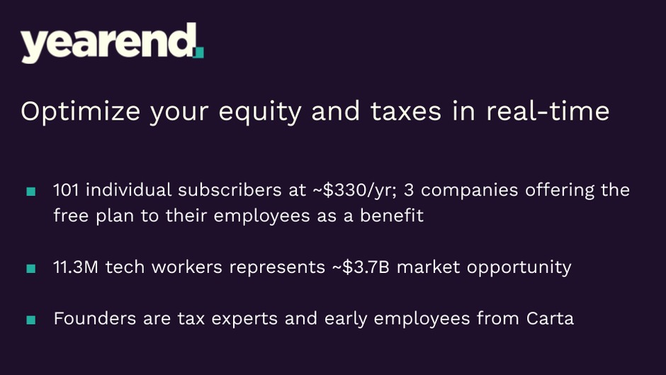
yearend did a nice job of including a lot of text successfully. They use design hierarchy to bring the name and one-liner to the forefront, then tell the full story with plenty of whitespace, color contrast and spot-on line-spacing.
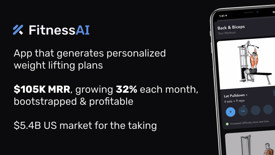
FitnessAI have very sleek branding, and also a great product-demo shot, delivering a top-level polished slide.
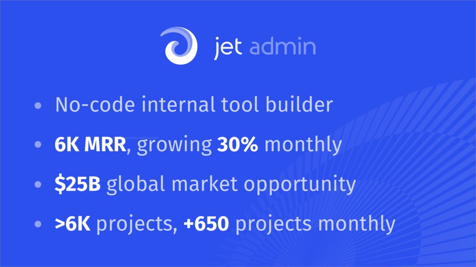
jet admin have created an elegant, easy to read slide. Their light contrast text and background decal make it easy on the eyes and even dare we say it, soothing.

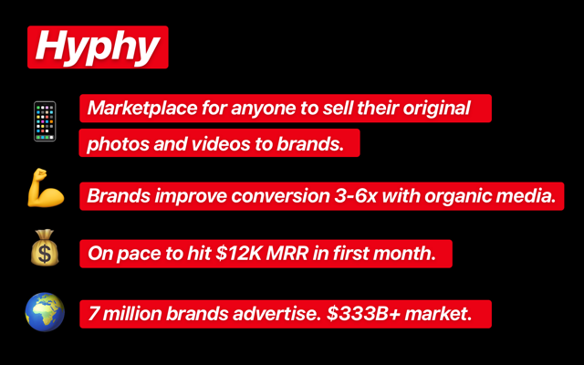
Hyphy have made their branding bold and distinctive, going as far as to design their slide just like the Instagram story advertisements they help build: a really cool example of merging your brand and your product. This also somewhat “breaks” conservative design rules, standing out for its individuality.
What are the design implications of the format?
We’ve designed thousands of pitch decks in our six year history, and written a lot about them:
- What we learned from designing 200 pitch decks
- Writing a great pitch deck
- A visual history of pitch decks
We think this format is a really interesting development. There are a number of design implications for founders and the industry at large:
- This drops the design spend and time for a pitch, assuming a traditional 10-20 slide presentation is not being created. This is great for allowing faster pitch revisions, reducing the re-design time to minutes/an hour when as story and key results change.
- This makes it feasible to have a “realtime” version of this slide online as the fundraising progresses
- With the reduced real-estate, you have to even less room for error—you need to impress with a very quick first impression.
For founders: How to make a good one-slide summary
First of all, your story and business metrics are going to be the most important component. Being clear on your value proposition, summarizing your company into a very clear one-liner and including two to four key indicators of your success/business potential are the tried-and-true pieces of a good pitch.
As a design company, we of course heavily believe in the value of design. Quite simply, today’s startup world has such high design quality that design competence has become expected as standard. The pitch decks of fifteen years ago don’t pass mustard today. Investors will subconsciously associate the quality of your design with the quality of your product/service, operations and leadership.
Design polish is table stakes these days—consider a high level of polish the bar for design competency. This means your fonts, margins, layouts, colors, hierarchy and whitespace should all be consistent, thought out and deliver easily digestible content.
Next up, you’ll want to employ strong branding. The brand will help your company be memorable, and help with familiarity and association between multiple touch points with investors. Visual brand is the sum of every element: logo, colors, illustration styles, fonts, decorations. All of them should follow a plan and ideally follow a well defined brand-book. If you’re an early stage company, having a key color and font, and using them consistently is a good start.
Finally, you want to stand out. Find ways to creatively differentiate yourself from the pack: investors in YC’s demo day are looking through 200 slides, and will easily fall into skimming mode. Give them a (good!) reason to pause and look at yours longer. You can do this though color (the majority of Demo Day’s slides were white, blue or black), illustration or having a different layout from the majority (most were a title and bullet points).
The final pitch
We hope you enjoyed this deep-dive into startup fundraising world—it’s a dynamic and interesting space. And of course, if you want some help making your company shine, we like to think we’re pretty good at it.

